Monday, November 29, 2010

Color Transforms

If any one product has been designed based around the transformation of coloring it has to be Vitamin Water.  The appealing colors of the labeling and dyed drink attract your eye while the false name seals the deal.  Many people find these drinks so attractive due to their healthy indications, but do you think a drink with vitamins and water is going to be  any of these bright colors shown below? They most certainly will not. 


First off, the drink claims to be a lightly flavored water hosting multitudes of different vitamins based on which drink you purchase.  In reality, the drink is water with a large amount of sugar masking the bitter taste of the vitamins.  The drink is so successful for a reason.  Coca Cola has created a drink that has the great taste similar to unhealthy drinks, but not nearly to the extent of Coke, making the public still able to believe it is healthy.  The UK even banned ads such as this one below due to falsified advertising including statements including saying the drinks are even better than vegetables.


Color is the direct response to what you perceive around it.  The designers who created the labels for Vitamin Water knew this when they used color matching in part of the label to match the color of the drink.  The other part of the label is all white, both to give some contrast to the information on the label and to make the colors pop and catch your eye.  The color and white combination also creates a somewhat pill-like presentation, representing the so called "health-based" drink subconsciously.

Through the deceitful masking of the vitamins in the color of the drink, and the nutritional appeal in the color of the labeling and colored marketing schemes, Vitamin Water has become a large success including ads from famous celebrities such as 50 Cent, and basketball stars Lebron James, and Dwight Howard.  With their clever marketing and use of color throughout it's design, they have completely transformed a poor product into a huge hit.

Design in Society

I am going to go out on a limb and state that the camera is the most Utopian designed object of the modern era.  The camera has been designed to create better and better images of everyday life, capturing everything from the snapshot to the extraordinary landscape in places most humans will never explore.  Cameras have been redesigned so many times and improved upon all the way back from the box camera to digital cameras such as the impressive Hassleblad H3DII-50 shown here.


The camera is such a Utopian design because of its ability to precisely capture everything in it's entirety.  Before cameras were around, painting was the most common form of reproducing what we saw.  The biggest problem with painting was that painters often did not have a Gestalt approach to what they painted and instead of painting a frame of literally what the saw exactly how they saw it, they painted it how they wished.  For example, if they were painting a portrait of a king, they would sit him in a chair and paint him, not him with an ugly background of what was around him.  This difference in the camera forced pictures to capture everything in its reality, even the wrinkles on your aging leathery face or your crooked decaying teeth or your weary look as you sit painfully in your chair.  Photography in this way made the camera into a weapon of sorts.  It could capture a true feeling and eventually would become a force, both in politics and society alike.  

Now with the number of cameras we have in todays world, people are ever more concerned with their image.  We must be ready at all times to have our image captured whether it is just by the passerby sneaking a peak with his camera phone, or the surveillance cameras stealing our personalities and watching our every move, ready to criticize.  If this object can push us to forever strive to become more and more perfect, whether this is or isn't a true perfection we are reaching, how can we not call it the most Utopian design?

Design is Dangerous!

Most of the time design is something that is used for good, but occasionally design can become dangerous whether it is purposeful or not.  A perfect example of design gone wrong is Pine Sol.  As you can see below, there is a stark similarity between the newly designed bottles of Pine Sol and Gatorade.  


The concern here is that Pine Sol looks much like Gatorade, and even though this is not a problem for most of society, it is a very big concern for parents of infants.  Young children may not be able to discern the colorful variety of Gatorade, which is super yummy, to Pine Sol, which is not so yummy, both in taste and when you have to get your stomach pumped from chemical poisoning.  The problem here too is that these chemicals can do a lot of harm to the small body of a 1 year old who is unattended for a few minutes while you grab a couple minutes of precious sleep.

Pine Sol's design incorporates the use of colored dyes in their product, making them more attractive to the shoppers eye.  Unfortunately this also creates a sense of child-likeness with it's use of color along with playful type on it's labeling.  This of course brings up our consideration of Pine Sol's design as it has to do with ethics in society.  Now, of course Pine Sol is not trying to market their product to children because if they kill them all off they won't be around much longer will they?!  It just further proves why such a simple selfishness in design can create heavy consequences for you as a parent if you are not responsible for your children.  Our moral of the story here is, even though design can be dangerous to us as human beings, be responsible for your actions.  Watch your children! 

Monday, November 15, 2010

Designing the Designer

As I was walking through the Domes' garden in West Davis, I found a little area that was ringing with peacefulness.  As I walked into that section covered in trees, the wind blew and let out a ringing of many wind chimes strewn about.  The wind chime itself was designed to be hung somewhere which has wind to move the chimes around until it hits against the hard object in the middle causing them to make a whimsical sort of music.  The wind chime produces something like the music I associate with hurricanes and tornadoes for some reason.  Random, chaotic, but beautiful.  The simple chaotic rhythm manages to put my mind at ease and be completely relaxed. I know what I want outside my porch someday. A hammock and a ton of wind chimes.


I think this says something about nature and design as a whole.  Nature is built of all sorts of rhythms and patterns and naturally these have stood the test of time.  As we have designed the wind chime to be a designer of new and unique music rhythms for ages to come, it is a designer in itself.  This is a sort of simple example of what I am trying to say, but we need to push for designing which lends itself to aiding other designing itself.  Whether this is designing things that design themselves, or designing things which aid us in the creation of new designs.  This is an idea worth exploring and I think many things could come from such a simple creation like the wind chime.

Jetpacks, the Definition of Ergonomic Design? Not Quite.

When we think of a design that is successful, it is most always ergonomic.  Ergonomic design is the creation of some thing which is meant for the specific use by humans and is designed so with comfort and efficiency in mind.  Jetpacks are usually worn on the back and use jets of escaping gases to propel a single user and allow them to temporarily fly.  On paper they are an amazing idea and even though they look mighty cool and techy, they are not the least bit ergonomic or even practical for that matter.  Jetpacks fail in all 5 ergonomic areas of research.


Jetpacks are by far the least safe mode of transportation you could take unless riding a velociraptor through a jungle of hypodermic needles filled with salt is an option.  They are designed to burn fuel to propel you forwards in order to take you to your desired destination.  The problem with this is that the fuel which is burned is being shot between your legs and down your back and is very hot.  It is also a little bit explosive.  Another big safety concern is the part where you have to land. Running out of fuel (which is of very limited supply already) could result in a pair of broken legs or if too high, death.

The comfort of using a jetpack is greatly flawed since there is really no way to be comfortable in a heavy  130+ lb. suit which is strapped on to you while it whips you around.  If you think about how a machine which propels you upwards has to be attached to you, you will realize that it is not just sitting on your shoulders.  It must either be hooked to a harness around your waist and between your legs or wrapped tightly around your chest.  To prevent it from flying off your back, unless you have loins of steel, it will likely be giving you the worst wedgies you have ever felt.

Jetpacks seem as if they would be a great device to get around quickly and easily, but in reality they have very little ease of use built into their design.  They literally burn through fuel to get you to your destination which can't be too far away, and unless it is at the top of a building, might not be much faster than using your Go Go Gadget Legs!  Once you reach a destination it is also a very cumbersome piece of machinery to lug around and it might be a bit hard to fit under your desk in your cubicle.

The performance aspect of jetpacks is, well, you guessed it, another weak aspect of their design.  As they only carry enough fuel to get your around for about 30 seconds, they will require refueling often and this could become an annoyance.  A slight miscalculation in fuel levels and you could have to stop on the 14th floor starport on the way up to your job on the 20th floor, adding another 10 minutes to refuel.  They also cannot be considered efficient in anyway since the fuel of a 30 second jetpack flight use will get you 500 miles in a Jetski (approximately from Japan to China, see step 43 below).  The only real difference being that the Jetski is limited to driving on the X-axis when the jetpack can get you up into the Y!

Step 43 above - indicates jet skiing across the Pacific Ocean. (maps.google.com)

Aesthetically, the jetpack is not the most visually pleasing design to look at.  Although it will get you lots of girls with it's sexy flames shooting down your back, it might be hard to pick them up since there isn't really any room for passengers.  They are a bit mechanical looking and really have not even been designed in the slightest to look good.  Design is merely a relation between form and function of an object and realistically, they haven't created a good function of the jetpack yet.  As you can see in the pictures, they are very bulky and not very sleek.

Jetpacks are not a very ergonomic design overall and in fact hardly can be considered a realistic design since it is so out of reach.  I mean, for a mere $250,000 you can have your own jetpack to fly around your back yard with.  But who knows?  Maybe some day they will be innovative technology, and everyone will have their flying licenses and when we turn 16 we will head to the DFV (Department of Flying Vehicles) to take our flight test.  As of now, they are not the least bit practical even for the most upper class, money wasting individuals.

Next time you think about buying a jetpack, stop it, then go to the link below.

http://jetpackjesus.com/

Monday, November 8, 2010

Word and Image in the Work of Brian Fies

Brian Fies visited our class last week and spoke about his graphic novels he wrote and illustrated.  He spoke specifically about his use of Word and Image in his work.  The one quote that really stuck with me was when he said, "I never want one or the other to be doing all the work.  I want [word and image] to share the load."  Brian back this up by saying that he is not a very good illustrator or write, so for him especially he can't lean on one or the other because it won't be there to support his big ideas he is trying to get across.  To me this makes perfect sense because you will have a stronger idea represented if both the illustration and the writing is working together to create a cohesive whole.  Two forms of media working together have to be more effective than one.  I mean, its like Mom always said, "Two media are better than one!" Isn't that how the quote goes?


I think that Brians work in comics especially thrives on the successful relation between word and image since this is the basis for all his work.  Images themselves are strong alone, and words themselves can be strong, but together they are able to accomplish so much if used properly.

Word and Image in Design

The use of word and image can take the form of many things throughout design.  Word and image can be found melded together to create typographic designs where the words or letters create the image itself.  Words can describe images, tell us what is beyond the image, or make an image into a moving picture in our minds.  There is only so much we can know for certain just by looking at an image or by looking at just a few liens of words.  No matter how great of a description you can give in writing, you will always have a slightly different vision of what it may look like.  Haven't you read a story and envisioned it and then seen a picture or film of the very thing being described and it was very different than what you perceived?
Just about all of design have both elements in it somehow, in some way.  Some good examples of this are the covers of books, CD or album covers and sleeves, comics, graphic novels, posters, motion graphics or any cinematography for that matter, and many other things.  A very strong use for the combination of word and image today is the idea of branding or logotyping.  Many large companies do this today such as Nike, Gap, and Target.Their logos are easily identifiable as they have been branded into our memory through the use of them on all their product lines.  Branding is one of the most influential types of marketing and could not be possible without the use of word and image working in conjunction.

Indie Games Continued

In my ongoing quest to find the newest and most innovative designs once again a hardly known indie game caught my eye when my brother showed it to me recently. This time the game is called Norrland.

An image from the game play


The game is based around living and hunting in Norrland, or Sweden.  The twist that did it for me is that it is designed with a very unique stylized set of panels.  No the art isn't anything mind blowing since it is an 8-bit game.  Everything is very simple, but the game manages to keep you on your toes with it's weird scenes and parts which will most likely challenge your own ethics.  Sure many people will play this game and instantly think, "Wow how perverse!" But honestly I think this is what makes the game for me.  I have noticed a lack of truly expressive games which involve interactions with things that aren't politically correct.  I guess the point I am trying to get across is that people are being conditioned to only think about happy thoughts and to think about things that are morally sound and correct.  In reality, I believe it is healthy to do just the opposite of this.  Games such as this one are created to be fun, sure, but also to question ourselves and know that just because I am playing a game which is asking me to press buttons to make my character masturbate and take a shit and much more (I wont ruin it all for you!), this doesn't make me perverse, or insane.  It just shows how I can separate my morals in real life from playing a game for entertainment.  Games such as these allow us to explore our inner dark sides without having to explore them in the real world.  Humans are born curious, and it is healthy to exercise this curiosity and explore the unknown in everything around us!

If I still haven't scared you off with all my blabbering, here is a link to download the game and try it for yourself!
http://cactusquid.com/games/norrland.zip

Monday, November 1, 2010

Indie Games

My definition of an Indie Game is something along the lines of an alternative game which tries to convey a message usually to take a critical view of society today.  Many games today are not designed to be innovative, but are remakes of older game ideas and washed up concepts.  Sure, the Halo series is fun and awesome, but really?  You do the same thing over and over and over until you find something better to do.  The only innovative part of the design of the Halo series is the creating of the leveling and ranking process behind the multiplayer game play.  Without this, a lot of the addictive properties that are attached to playing online would be lost.  But back to my main point!

The ideas and innovation behind many Indie games today are simply amazing!  It is truly tough to think outside the box these days since so much influence is forced into our minds with all the visual stimulation we receive in todays society.  People think that games should fit into one of a few categories such as a first person shooter or a role playing game, but these indie games I have found create their own simple, yet innovative ways to use games to stimulate creativity.


A great example of an innovative indie game is We the Giants (above), created by Peter Groeneweg.  In this game you play as the very small, but very wise "giants" shown above.  Peter is making an attempt at showing everyone can be a "giant" not by being literally monumental, but by being influential and inspiring to those around us.  The game is less than ten minutes long, and you go through a couple tutorial levels showing you how to move and explore the terrain, where finally it takes you to a screen where you sacrifice yourself by becoming a stepping stone to reach the sun.  Once you have sacrificed yourself you are allowed to type one set of inspirational advice which gets uploaded instantly to his blog.  Everyone in this sense works together to reach the ultimate goal of getting to the sun even though they can only play through the game one time and contribute their two cents once.  Additionally, you can go to his blog and see everyones advice which is quite a treat and can be either very inspiring, or even very rude.  Some people don't take this part in the game seriously since they think it doesn't matter and this in turn effects what is posted on his blog.  Even though the system isn't flawless, I believe it takes huge leaps to interactive and stimulating gaming design.

Mass Production of Industrial Design

I know, it is sexy isn't it?  I mean anyone without a bias PC/mac opinion wants one.  The only problem is that this sucker costs a bare minimum of $2,000.00  And this is for the Macbook Pro with the lower standard hardware.  If you want the good stuff it is going to cost you upwards of 30 C notes.  I am extremely impressed with the design team at Apple because they continue to pop out sexier and sexier designs for all of their product line of gear from the Macbook Pro to the iPod to the newest iPhone.  I purchased a brand new laptop with better specs in every category than the Macboo Pro for just under $600.  This is less than a third of the price for mainly the same or better of a laptop running a different Operating System.  Sure you can say that your laptop wont get any viruses or is easier to use or whichever classic Mac argument you want, but when it comes down to it, mine will last me at least two years before it is useless, yours maybe 3 or 4? Maybe 5 if you are lucky!   I feel as if I am already underestimating the windows laptops, but still for the money, I will have 3 or 4 laptops when your 1 is dead and used up in a few years for the same amount of money.  Not to ramble on too much about the price of competitive brands, but I am really saying that the Apple design team has promoted such an appealing image of their product that they are selling like hotcakes.

Apple has been one of those companies that has really risen to the top in the last few years and not just for no reason.  They have allowed for their products to meet in a fair medium between form and content designing.  Their software is designed to make even the most complex computer tasks easier to handle with their simple OS.  They have many gadgets and doodads thrown about within their software simplifying the everyday tasks to make them easier and more efficient.  Not just their software design is sexy though.


The form of the Macbook Pros and even more specifically focused on form is their newer Macbook Air product line.  This is the thinnest laptop on the market and is even lighter than ever.  Apple has teamed up these sleek forms with content and packed a one, two punch.  To make it even more dominant, they created genius advertising!  Everyone knows Apple advertising because everyone has seen it.  It is everywhere, and it portrays the young and hip sporting their favorite Apple products.


Apple is most famous for their iPod advertisements which are a black silhouette of young adults frozen in the act of dancing with the different iPods in their ears, ready to get their groove on!

Where Content and Form Intersect

In our film screening of the movie "Objectified" Thursday, many ideas about design were approached, but one of the biggest ideas in my mind was the interaction between content and form in design.  Looking within the movie itself, it became apparent that we overlook many everyday items in our lives and the functionality of their designs.  This idea was put forth in such a way that the content was able to hit home while the forms in which they did so were sexy and appealing to keep the viewer interested.  The movie was great and really allowed me to open my eyes to different ideas within the design realm, but I would like to take it a bit farther and talk about a specific example they used to talk about the interaction of form and design.

During the beginning of the film, they had different designers talk about the interaction of form and design and where they intersect and where we are headed.  With our newest technologies leading us into the realm of visual stimulation by screen, most of our designing must be software design for a product to become well liked.  In Objectified, they talked about how they designed one of the first laptops and how they were so proud that it was strong and durable and had a little scoop on the back end that would reject any foreign objects that slipped down into the hinge so that it did not get jammed and all this was great design, but when they went to use the laptop, people saw straight past this exterior design of the laptop and focused on the ease of use of the software.  Instead of the form being the main focus in their design, it should have been the content and more in todays society we have been finding this to be true.  This is the case with cell phones, computers, mp3 players, GPS devices, etc.

Looks like it is time to head into the age of computers and learn how to design content!

Tuesday, October 19, 2010

Designer: Chris Milk

Before I say anything about the genius of Chris Milk, go to this website, type in your address and watch this music video. 

http://www.thewildernessdowntown.com/

I hope you liked it, and if you aren't a fan of Arcade Fire, then hopefully you could at least appreciate the style in which Chris Milk designed their experimental video.  I think that this innovation in designers is the sort of thing that creates a name for yourself.  He has made videos before, and is obviously not a no body, but Chris stuck his head out on this idea and went for it.  He used a completely foreign HTML5 to design his interactive short, where it pulls up a Google Chrome image of your house and incorporates the viewer to engage them in the video.  

Sure, many people could think of ideas like this, but to actually attempt and succeed in creating this video is amazing to me.  The coding is far past my understanding and I think this is what is often scary for people with big ideas.  It is easy to give up on a big idea when you don't have a clue how to start or even how to build a framework to support your ideas.  This may be what separates the great designers from designers.

Chris Milk has also done many other short films, like this one titled "Last Day Dream"


Another of my favorites from his works is "Who's Gonna Save My Soul" where he did a music video for Gnarls Barkley.

Monday, October 18, 2010

Compare and Contrast


Above is the short directed by Chris Milk entitled 'Who's Gonna Save My Soul.'

I newly discovered Chris Milk and his body of works as I will go into further detail later. I realized after watching this short film that his style is somewhat similar to the more widely known Spike Jonze. Spike has a similarly themed video in which he worked with Kanye West as his primary actor. Here is Jonze's video titled "We Were Once a Fairy Tale"
Part 1:

Part 2:


Both styles are a bit dark, but cut right to the heart (sorry for the bad pun). I think this was also shown very well in Jonze's recent remake of Where the Wild Things Are.  They have very similar styles especially in the first two videos I posted as they both involve cutting into their chests to pull out fictitious living creatures, one being his broken heart and the other being Jonze's interpretation of a man's soul.  I can really appreciate both of their bodies of work because they are very abstract and also notion at critical emotions that we don't even like talking about often.  Instead we are able to view their short films and have a conversation with the director in relating to the portrayed situations.  As I have stated in previous posts, I believe that it is in the best art that the artist can get straight to your physical emotions and play with your thoughts.

Design as Conversation

As Housefield stated in class last session, design is a conversation.  Whether design is a conversation between a designer and his or her client, or whether it is a conversation between a design you just published and your audience viewing it on a local billboard, or whether design is a conversation between Lady Gaga and Yoko Ono talking about how the sun is down on stage.

Design is often thought of as the communication of ideas towards your audience and one of the best visual artists and maybe the least known is Yoko Ono.  She often did exhibits about allowing viewers to interact with her art work.  The greatest part about this to me was that it got the viewer to be visually and mentally simulated and thinking about ideas involving her art and even politics as she and John Lennon were very politically forward and driven in their actions.

Communication is not always through the sound waves stimulating your ear drums, but can also happen through your retinas via visual elements and designs which are pleasing to the eye.  This the study of design as a communicative process, since to be a successful designer you must be able to communicate to your audience verbally and visually in a quick and concise manner.

Monday, October 11, 2010

Flowers Are So Pretty

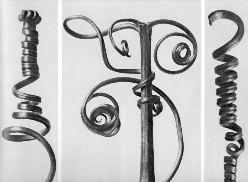
As an amateur photographer, flowers have to be one of the more cliche things to shoot. But I must add, Blossfeldt sure makes me look stupid for even thinking that. One of my newest man crushes in the photography world is Karl Blossfeldt. He is known for his famous images on flowering plants such as his work titled "Pumpkin Tendrils, 4x Magnified," shown below.

Photobucket
He certainly is a very similar photographer to me in style, and in no way am I trying to compare my photos to his since they are no where near his level. His shots became most popular in the late 19th and early 20th century. Mainly, these photos consist of natural forms he has found, usually at a macro level, which he magnifies to create huge prints of anthropomorphizing forms. The way he designs his shots also add to this specifically because they are shot in studio lighting with a blank backdrop, further bridging human and nature. For some it reads as if he is making a comment on the natural forms of humankind, and for some it reads as a showing of the similarities between humans and their close relatives of the plant kind. I personally feel as if Blossfeldt was a revolutionary of the early 20th century. Not only did he say what he wanted to say his photographs, but he did it in a completely different way than anyone had done before. This was the time of painting and photography was still looked at as a sort of documenting, not the designing of thoughts. He got his message across not by telling people what he thought, but by showing them, with real photographic evidence. Although he may have never called himself a designer, he was a designer of modern photography. I still find myself shooting in his styles far after he has lived.
Photobucket
Photobucket

Creativity from Without

Tim Brown is a designer that inspires me to do what I love and that is designing.  Brown has given a few talks at the TED conferences in Monterey, CA.  One of these is his talk on thinking big.  One of Tim's main ideals as a designer and as an artist is to 'Think Big'.  To him, this means not only going to work at your design firm and reskinning simple designs and looks for other things.  Brown talks about how many designers today are underused in his speech on 'Creativity and Play'.  One of these points is exactly what he was talking about here in that he doesn't want designers to just go to work to get paid to do mundane things that any graphic artist could do.  He points out that you should design the frameworks for objects as well as design the skins for them.


I think that he is completely correct about this since you can be a decent designer and get away with just reskinning for big firms and making your money to pay the bills, but the truly great designer would put that on the line to go big for a greater cause.  This may be hard to justify, but I would like to think that I have this quality in that I also try to go big whenever I can.  A lot of times you can come out and just look dumb, but that one time when you succeed and come out on top makes all those previous attempts worth it.

Stone Soup

Last class we had a great activity planned called Stone Soup.  The basis for this was directed towards the lessons shown in the book, Stone Soup, by Maria Brown.  Everyone brought a few items, whatever they wanted, and we all threw our stuff together to make an object.  Everyone brought quite a few things such as duct tape, string, paint, paper, and even more odd objects like tubes and CDs.  As we thought about what to make with all our items laid out on the table, we thought, maybe it would be interesting to try to make something natural out of man made objects instead of usually making all these things out of what were once natural materials at some point.  We didn't even talk about what we were going to make.  We just made it.  

That is what was so great about the Stone Soup project.  Everyone brought a few little pieces of themselves to the activity and our group turned it into an object inspired by their own individual lives.  This is just the same as design and how designers work.   Each designer brings their own experiences as objects and cooks their own stone soup to better the world and feed it to their peers.  I feel that often times designers attempt to redesign other works they have seen and these can be good works, but truly great design comes from originality, inspiration, and motivation within.  Sometimes the best work of designers doesn't only redesign something, but creates some unique way to prevent the problem other designs are merely fixing.

Monday, October 4, 2010

My Attic: Fuzzy Like a Childhood Memory

One of the first positive memories I have which impacted my life is my attic in my house back at home. I wish now that I could stay there forever. There being that time of innocence in my life and there being in that attic where no one could hurt me. My attic made such a strong impression on me because it was no ordinary attic. My family converted it into a sort of playroom. It was filled with pillows, blankets, and giant bean bags. These were no ordinary pillows either, but a mix and match of all sorts of crazy shapes and textures. Just to give you an example, I specifically remember one that we had which was a corduroy covered square pillow which had two big arm pieces attached to either side. Even though as a young child you really aren't faced with many responsibilities, it still felt like I could get away from the chaos and hard work of dealing with my two brothers and family. I could go up there any time and cover myself in blankets and pillows and feel at rest. The room had a very soft quality to it between the literal softness in the blankets and pillows covering the floor to the visual softness of the single yellow light that dimly lit the space in which I spent so much time. The space could also be so easily recognized because of its musty attic smell. Not a bad thing by any means, but just very unique. This smell is now something that when I smell, I instantly recognize and identify it with my attic and my childhood. I think the way we designed the room completely changed my outlook on attics and similar spaces. I think most people would see a basement, attic, cellar or the likes to be seen as eerie, unsanitary, rat infested, and dust covered. Places that people do not want to spend time. When I think of an attic I think of just about the opposite of this since my attic was such a secure place in my younger years and I often find myself still wanting to spend time in these areas simply because of this transition in design my parents offered me.

Sunday, October 3, 2010

Pop Art in Sportswear

What are our motives in buying clothing and more specifically in sportswear?  We are influenced by fashion trends around us and right now that is Pop Art.  Not only is it popular in our everyday culture as Americans, but it could be growing into sports swag near you.  Now, I am a HUGE San Francisco Giants fan, so naturally when my Dad texts me, 'Want to go to the game Friday?' I freaked out. I was walking to the ballgame the next night in hopes of an NL West division clinching win when I noticed a person walking by with an interesting t-shirt which had an unfamiliar silhouetted face. This got me thinking. I have been wanting to design some Giants t-shirts simply because I feel there is a lack of creative design in sportswear. Pop art is in right now, and incorporating this into sportswear could very well bring a lot demand.

In a fashion context of design I think you can either follow trends or create new trends. If you are an established design group and you have a big enough name, you most likely have the freedom to pretty much do whatever you want. This would give you the option of creating trends. Otherwise, if you are trying to make it in todays market, you would probably have to design something that would be following a current fashion trend. Do what is in and it will be easier to catch the eye of people around you. Often, if you try to create a new trend it will be seen first as weird or unusual. But don't get me wrong, because you definitely don't have to just copy everyone else and not be even innovative and good designers will do just the opposite of this. They will take current trends whether it is in fashion or any other field of design and take it to the next level. Design to me is just this. Sometimes people fall into the mindset of copying everyone else out there when you should just be yourself and let everything around you in your unique lives inspire your creation!

Tuesday, September 28, 2010

Design: Verb or Noun?

As the act of designing creates the people, places, and things around us, it becomes a noun and a verb working in conjunction. I don't think you can have design as a noun without design as a verb. You can use anything as an example of this, but let's look at computers in specific. The very computer I am typing on right now is about a year old and is a work of design by Hewlett Packard. Whether this design is focused on ease of customer use or maybe just designed to look shiny is really up to them and without the act or verb of designing, it would never change. The verb to design changes everything around us and (hopefully) improves upon previous designs creating the noun, or designed objects which we use or see everywhere!

I think that it is awesome that we have homework to blog about design in general since I have always wanted to do that sort of thing, like write down my ideas or talk about them with friends, but I never have gotten around to doing it. I hope to take a lot from blogging in this sense since I will be required to do what I usually can allow myself to put off. This is a little ironic to a point since this is exactly why the noun 'design' is nothing without the verb 'to design'. To be a successful designer you need to be sketching and writing all your ideas down to get them down on paper and elaborate on them. Some ideas will never make it past that point, but your better ideas will grow and evolve into great works of design.